Wednesday, 23 March 2016

Location Shots

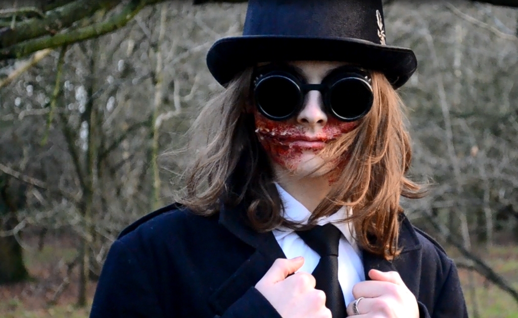
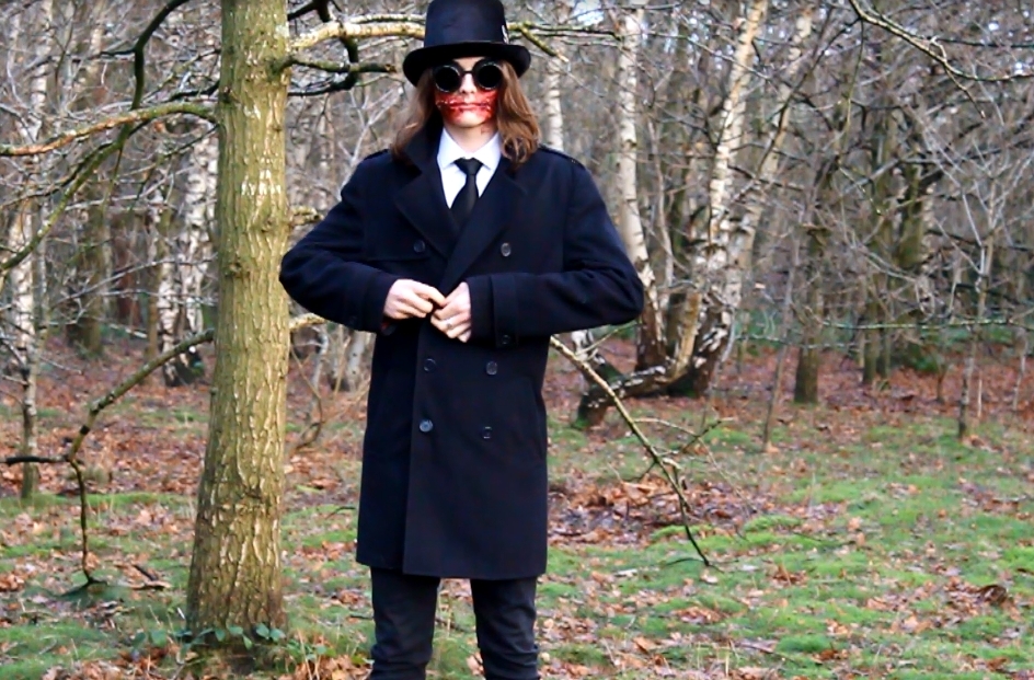
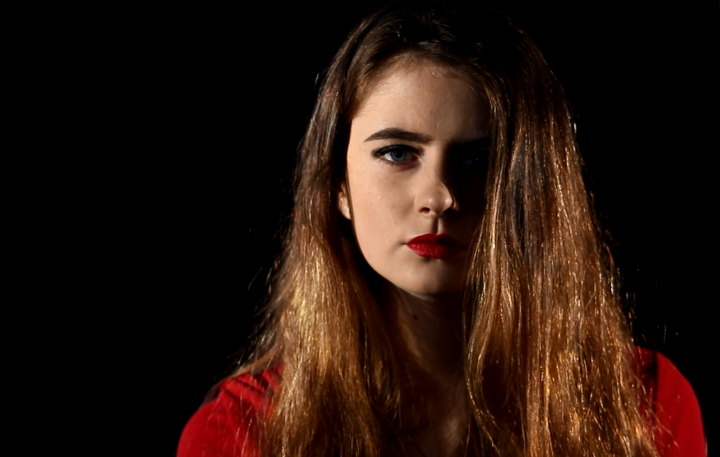
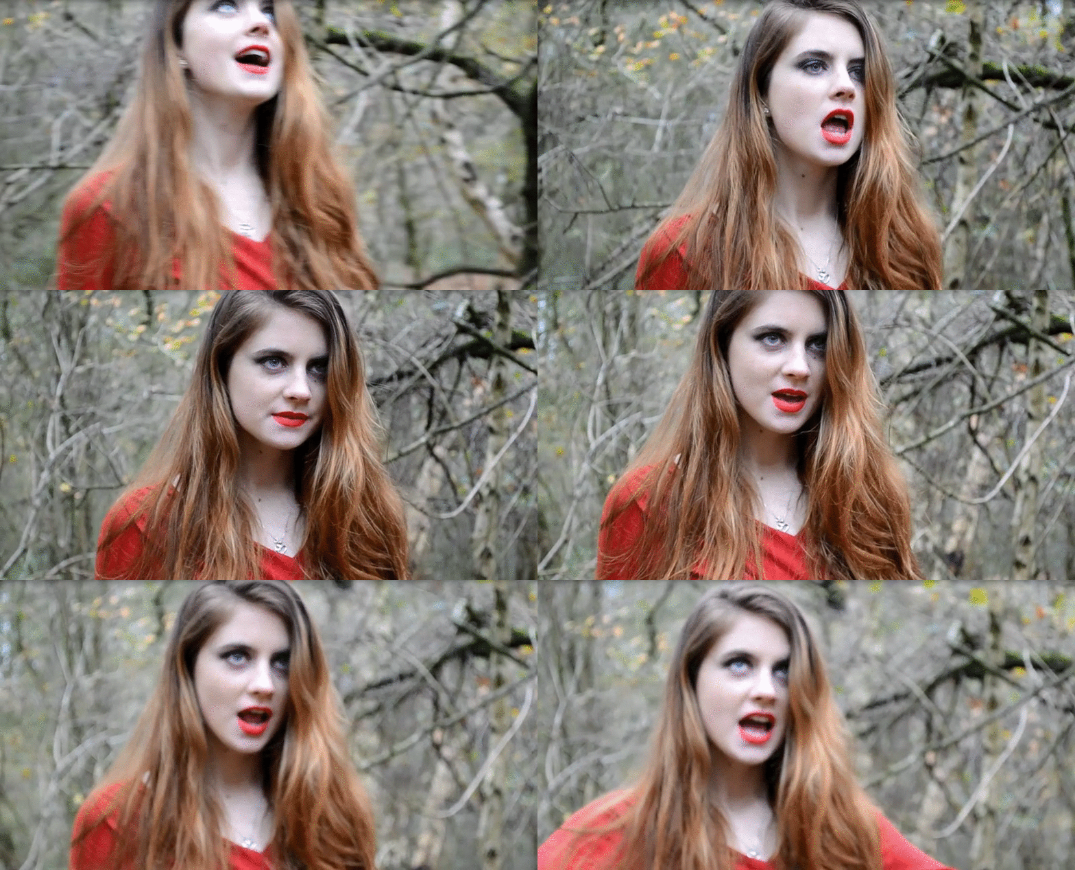
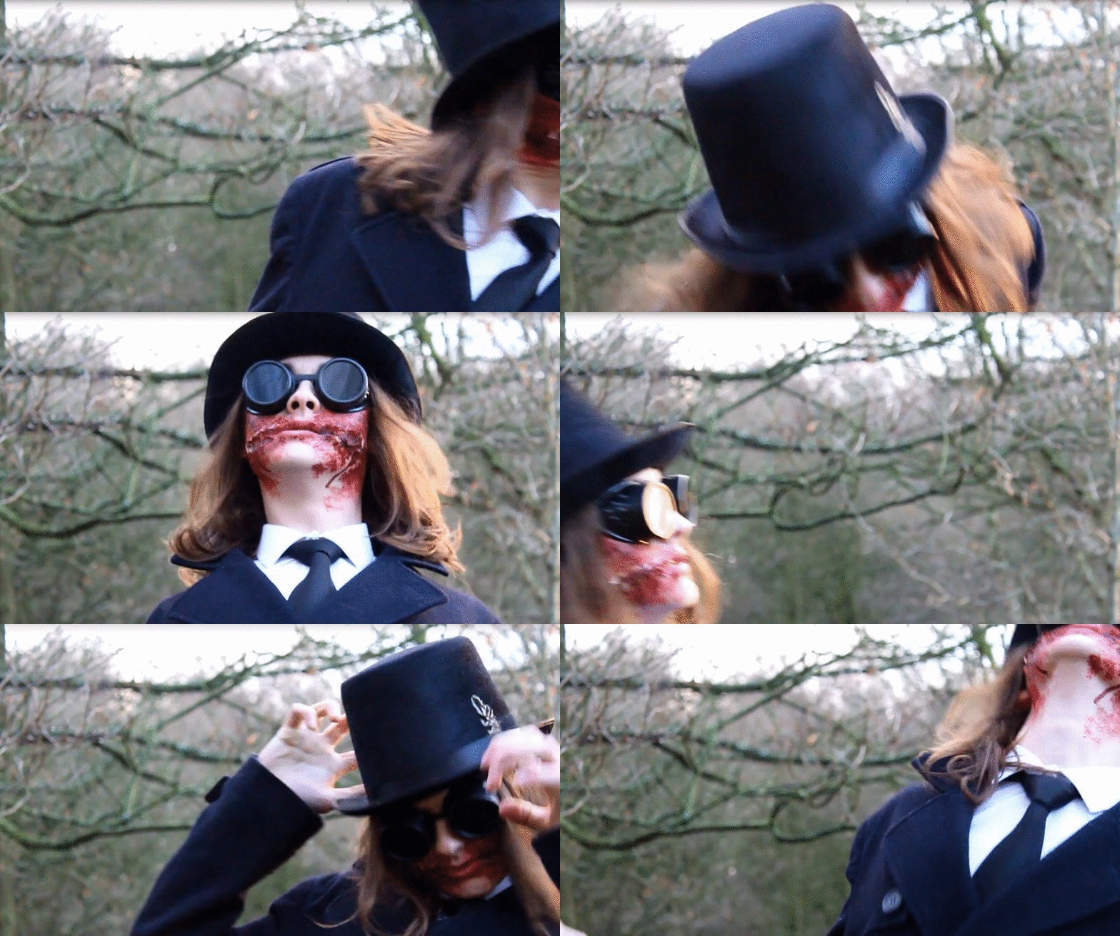
Woods Location Shots


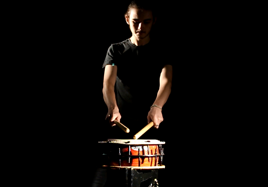
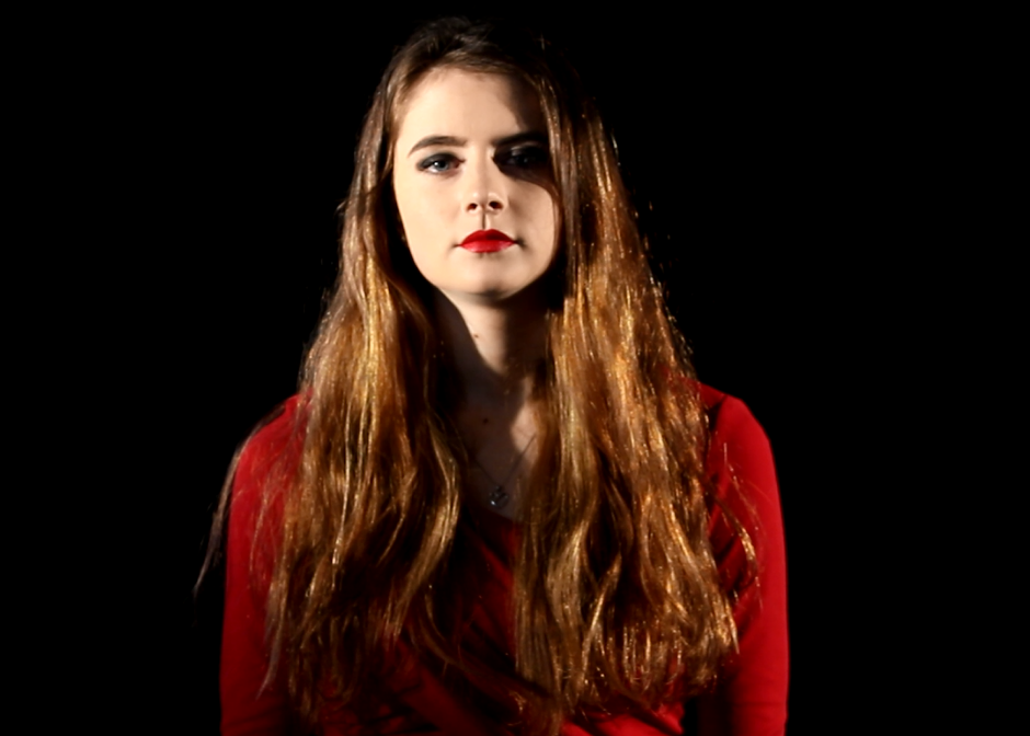
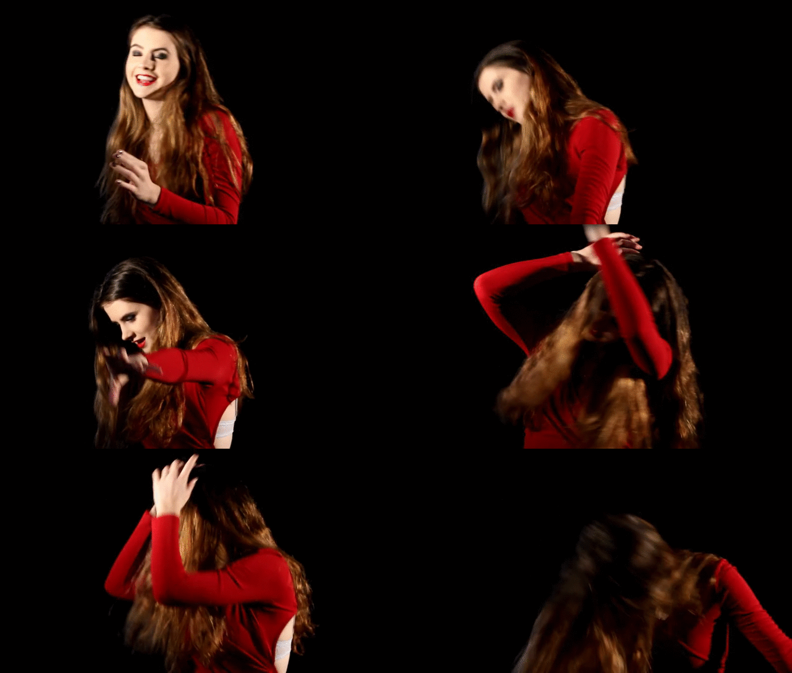
Studio Location Shots

Poi Shoot Location Shots

Sunday, 20 March 2016

Filming Bloopers / Shooting Evidence

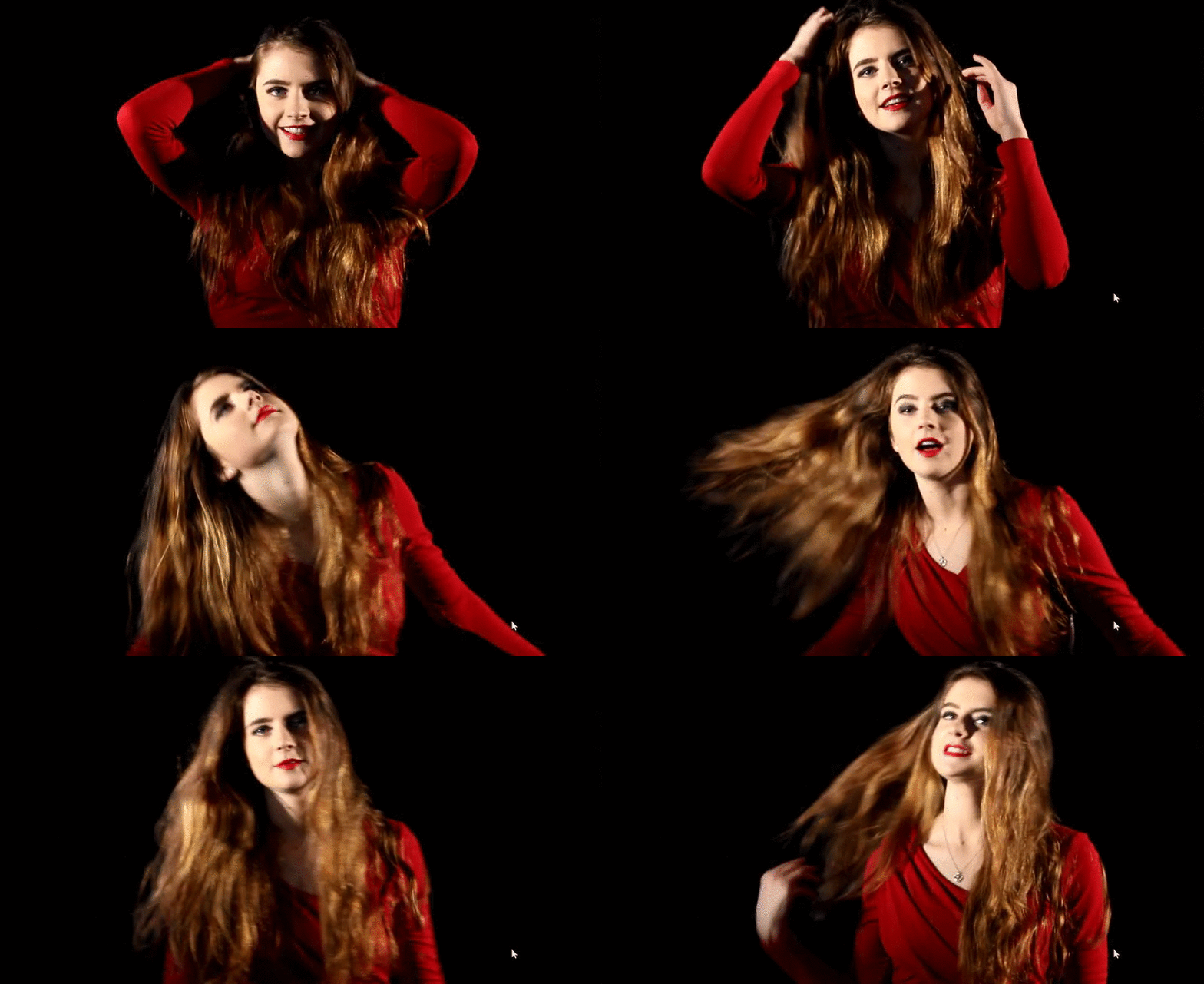
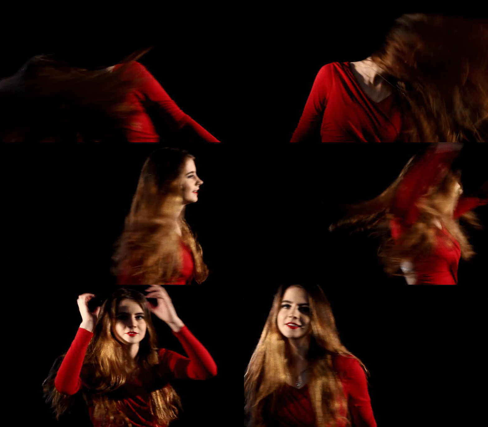
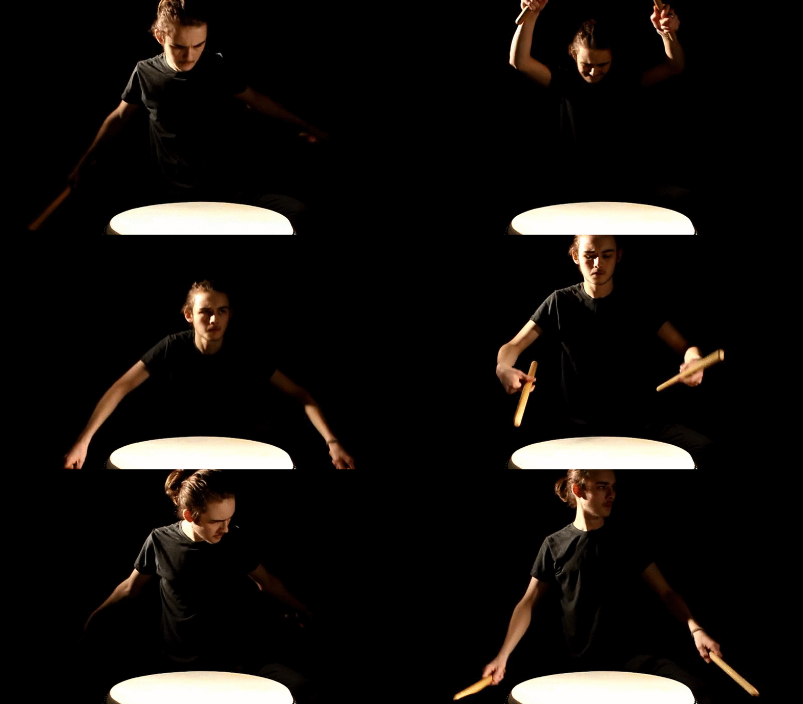
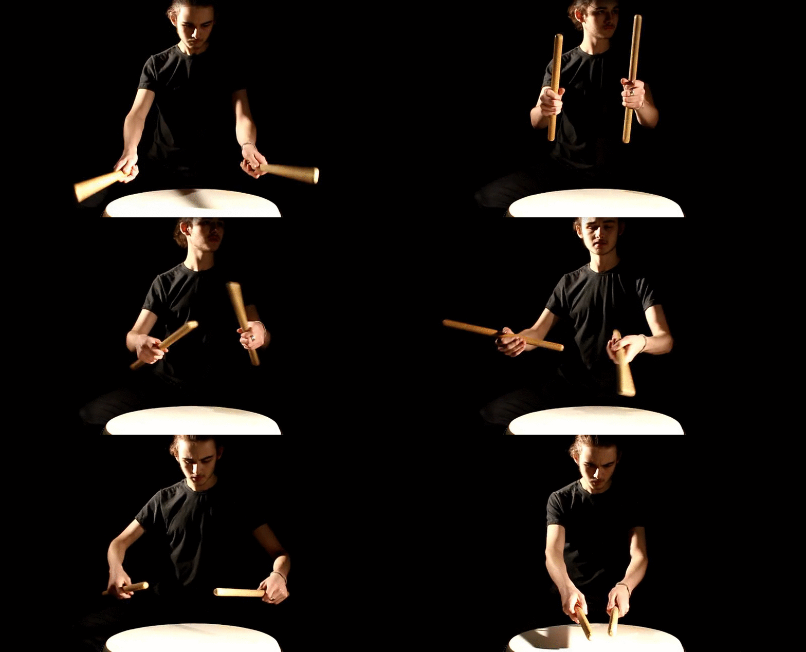
Below are photos and gif's I've created to give proof of shooting.

All poi was performed on my own driveway, this can be seen in the background of the photos because their is two working vans in the background. These are both owned by my family. Due to the fact I live on a Cul-de-sac and I live at the far end, there was no car or human interference. The image below taken in the street was done to represent the space needed to actually film the poi, the filming of the pio being on fire was done on my own property.


Tuesday, 15 March 2016

Magazine Advert

Creation Process
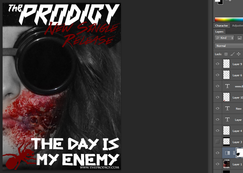
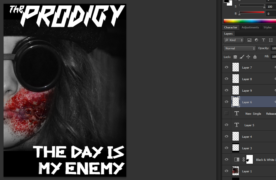
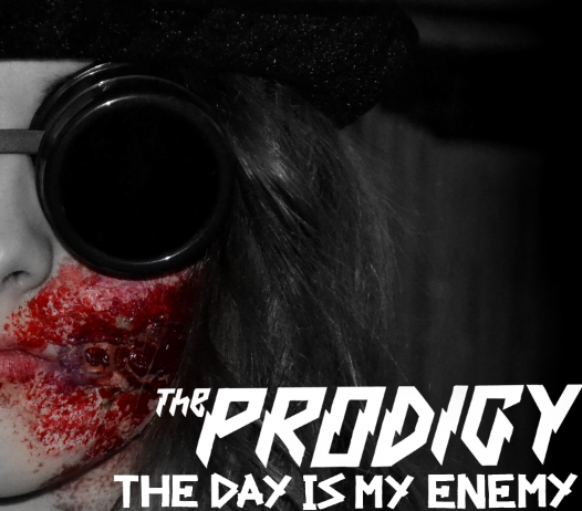
1) To start with I took the same image I used on my digipak and put it into a magazine sized format on Photoshop. I also took the save filters I used on my digipak and copied it across to my magazine advert. I then positioned this somewhat central, and added a black banner across the top and bottom of the image for font. I added this black banner to the top and bottom of my image so that the font would be more legible against the image. Although the font is not contained completely within the banner, the bottom of the font does overlap somewhat. The reason why I did this was because I was aiming for an effect also given on the 'Jessie J' magazine advert. This overlapping of  font initially breaks the boundaries on the advert I created, this is something which links to the genre of music I chose to do a music video on; Heavy Metal is often recognized to break normal conventions and do things differently to other music videos and genres.

As you can see from the screenshot below I have experimented with the layout of my image, and the way in which the font is placed. On the screenshot below the black banners are not contained and the font is just placed over the image. As you can see it makes the font a lot less legible and depending on the size the advert is printed in, if small it'd be almost impossible to understand what is actually written. Due to the fact this didn't work as I would have liked, I added the black banners again.


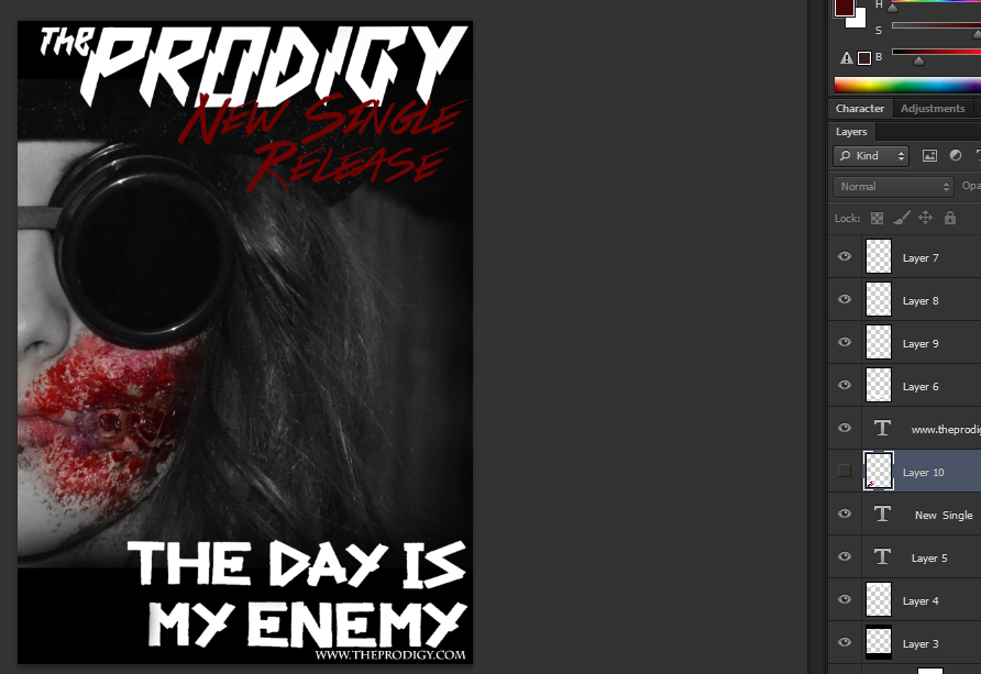
2) I then added the same typeface that the prodigy use onto my magazine advert, and placed it at the top. This typeface is their iconic logo. I then added the logo in which the prodigy always uses for their new song " The day is my enemy " I placed this along the bottom banner of my magazine advert.

3) Once the main text was done, I then added the website address the the bands ant logo. I primarily stuck with a simplistic design, with right aligned text, I did this for the main reason so I did not cover up my models face on the advert.

Refinements & Feedback
As for refinements and feedback I decided to create two almost identical magazine designs, but change the Prodigy's Official Ant logo at the bottom. The colour was changed from red to white, and from this I make a tally chart, and questioned people on what they thought was better. Going on what my audience feedback gathered I decided to go with the popular opinion of the " Red Ant Design ".

Below is the tally chart I took to gather my information.

Final Design

Sunday, 13 March 2016

Magazine Advert Research

Examples


Analysis
As you can see from the image below the magazine avert I will be analysing will be a piece of promotional material from Chase and Status.The first thing I am going to analyse is the colours used throughout the advert. Firstly you can see the use of monochromatic imagery fits well with the vibrate use of yellow hues. These hues are highly saturated and by doing this it draws the audiences attention towards the most important information. As you can see from the advert below the most important piece of information on the advert is the bands name, the tour, and where the tour is heading, and the bands website address. As for the other colours, the remaining font colours are of a white hue. This is to contrast against the yellow text, and draw more attention towards the yellow parts. For example if it were yellow and red text, the audience would subconsciously find it more difficult to pin-point the important information.

As for font and layout, we can see that the hierarchy of text starts in with a center alignment, and at the top of the advert. This automatically brings the readers attention to the most important piece of information, which is " Chase and Status Live ". The typeface which has been used is an ordinary sans serif font, but this is done to keep consistency throughout products the band released, this is obvious due to the fact that the rest of the bands merchandise keeps the same font and colours

The second magazine advert I am going to analyse is a Jessie J magazine advert for her album. The first thing I am going to analyse is the colours used throughout the advert. Firstly you can see how the avert uses images and text to make an effective layout. The image used is of course of the artist, and this initially helps sell the product to the audience. The use of limited colour throughout the image helps contrast against the gold / yellow typeface hue. In the black banner section at the bottom of the advert you can also see the yellow colour being used again. This helps keeps consistency throughout the product, linking the text and the image nicely. The colour, like the Chase and Status magazine advert above draws the audiences attention towards the most important information. As you can see from the advert below the most important piece of information on the advert is the artists name, the song information and the website address. This is similar to the tour magazine advert Chase and Status published. As for the other colours, the remaining font colours are of a white hue.This is to contrast against the yellow text, and draw more attention towards the yellow parts. This is also similar to the Chase and Status version.  

As for font and layout, we can see that the hierarchy of text starts in with a center alignment, but unlike the Chase and Status advert the font starts at the bottom of the piece of work instead right at the top. This is done so that the artists face in the image is not covered up. The typeface which has been used is an ordinary sans serif font, but this is done to keep consistency throughout products the artists releases.

Wednesday, 9 March 2016

Digipak Feedback

This is the feedback I got on my Digipak.
To generalize, it seemed as though my digipak worked well, the feedback I got on the font choices, colour schemes and the consistency of my product to my final product ideas work well together when quickly analysed by audience members.

Tuesday, 8 March 2016

DigiPak - Own Design

Creation Process

1) To begin with I planned to take a variety of images after filming one of my actors. This specific photo-shoot was aimed to take photos primarily of my male actor whilst he had the ' horror ' make up on. During the photo-shoot I gathered a large collection of good quality images. When it came to creating my digipak, I simply referred to the images I took previously.

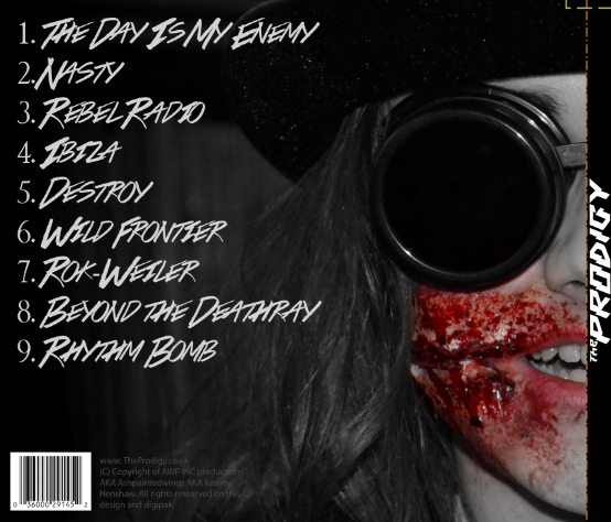
2) Secondly I downloaded a four panel digipak template for Photoshop before starting to arrange my typefaces and Images on top of the template. Starting with the front cover, back cover and spine. I arranged two pictures of my actor in the same position on both the front cover and back cover so that his featured lined up perfectly. Removing either the right side or left side of each image, it gave me the effect that he was both smirking and having a normal expression at the same time.

3) Starting to add the text on my front cover and song list on my back cover, I used two concordant typefaces. On my front cover I simply used the bands original logo ( to keep consistency ) and placed it on a right alignment. For my back cover I used a font I found on Dafont, but putting down a track list, copyright material and bar-code.

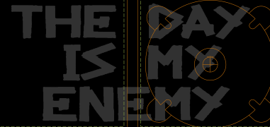
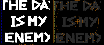
4) Moving onto the Disk cover and the inside casing, I used the bands own typeface ( the one they used on other products with the title " The Day Is Our Enemy " on ). To keep consistency throughout my products I used a saturated version of the text on the inside cover, and then a desaturated version of the text on the CD cover.


Refinements & Feedback
As for refinements and feedback I decided to create two almost identical inside cover digipak designs, but change the song title slightly within each design. After doing some audience research, It was concluded that the first option was the better one.

Below is the tally chart I took to gather my information.

Final Design


Monday, 7 March 2016

DigiPak Research

What is a DigiPak

A digipak is a type of packaging for specific disk, normally a CD. Generally made out of cardboard or plastic different designs of digipak can contain internal slots or trays for information leaflets and disks. There can be different types of digipak, for example some have four panels and some have six. Like stated previously digipaks are made from paperboard or cardboard, thing being the outer build, with one or more plastic trays inside capable of fitting multiple disks. Digipak style cases grew in popularity among record labels in the early 2000s due to there easy maintenance and cheaper cost. There is no common name for Digipak style packaging made by other companies, the term digipak or "Digi-Pak" is often used generically.

Examples
Analysis
As you can see from the image below the first digipak I will be analysing will be a Nine Inch Nails product. Primarily the first thing which draws the audiences attention is the use of colour. This dramatic colour scheme limited itself though to only blue to white hues. On the first panel the bands album cover is a desaturated blue colour, the image which has been chosen also only consists of a monochromatic colour scheme. This means there is no other colour than blue in the image.

Another thing which is prominent in the Nine Inch Nails digipak is the use of font and consistency. Both of these factor are important to make an effective album design. Although the picture is not completely clear on the smaller body text, the title of the bands album is noticeable a sans serif typeface. The colour of this font consists throughout the rest of the design being that all type is either a light blue hue or white. As for the bands name they have their logo which is a completely ordinary thing to do. This is also to keep consistency. By linking specific logo's and imagines it makes it much easier for audiences to recognise which band has released curtain merchandise.