
Creation Process
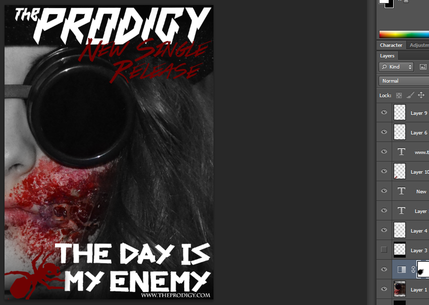
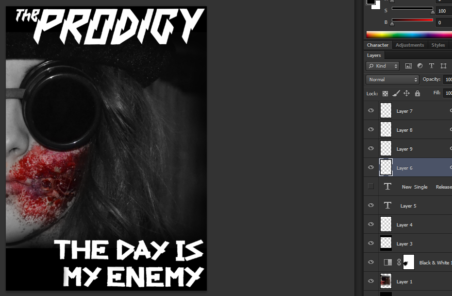
1) To start with I took the same image I used on my digipak and put it into a magazine sized format on Photoshop. I also took the save filters I used on my digipak and copied it across to my magazine advert. I then positioned this somewhat central, and added a black banner across the top and bottom of the image for font. I added this black banner to the top and bottom of my image so that the font would be more legible against the image. Although the font is not contained completely within the banner, the bottom of the font does overlap somewhat. The reason why I did this was because I was aiming for an effect also given on the 'Jessie J' magazine advert. This overlapping of font initially breaks the boundaries on the advert I created, this is something which links to the genre of music I chose to do a music video on; Heavy Metal is often recognized to break normal conventions and do things differently to other music videos and genres. As you can see from the screenshot below I have experimented with the layout of my image, and the way in which the font is placed. On the screenshot below the black banners are not contained and the font is just placed over the image. As you can see it makes the font a lot less legible and depending on the size the advert is printed in, if small it'd be almost impossible to understand what is actually written. Due to the fact this didn't work as I would have liked, I added the black banners again.
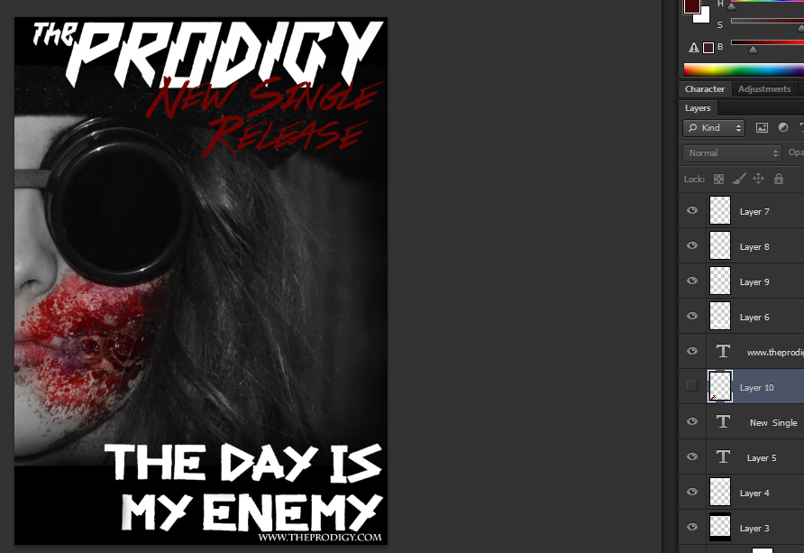
2) I then added the same typeface that the prodigy use onto my magazine advert, and placed it at the top. This typeface is their iconic logo. I then added the logo in which the prodigy always uses for their new song " The day is my enemy " I placed this along the bottom banner of my magazine advert.
3) Once the main text was done, I then added the website address the the bands ant logo. I primarily stuck with a simplistic design, with right aligned text, I did this for the main reason so I did not cover up my models face on the advert.
Refinements & Feedback
As for refinements and feedback I decided to create two almost identical magazine designs, but change the Prodigy's Official Ant logo at the bottom. The colour was changed from red to white, and from this I make a tally chart, and questioned people on what they thought was better. Going on what my audience feedback gathered I decided to go with the popular opinion of the " Red Ant Design ".


Below is the tally chart I took to gather my information.

Final Design

No comments:
Post a Comment