
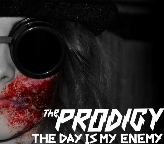
1) To begin with I planned to take a variety of images after filming one of my actors. This specific photo-shoot was aimed to take photos primarily of my male actor whilst he had the ' horror ' make up on. During the photo-shoot I gathered a large collection of good quality images. When it came to creating my digipak, I simply referred to the images I took previously.
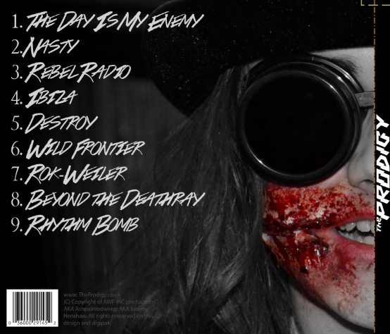
2) Secondly I downloaded a four panel digipak template for Photoshop before starting to arrange my typefaces and Images on top of the template. Starting with the front cover, back cover and spine. I arranged two pictures of my actor in the same position on both the front cover and back cover so that his featured lined up perfectly. Removing either the right side or left side of each image, it gave me the effect that he was both smirking and having a normal expression at the same time.
3) Starting to add the text on my front cover and song list on my back cover, I used two concordant typefaces. On my front cover I simply used the bands original logo ( to keep consistency ) and placed it on a right alignment. For my back cover I used a font I found on Dafont, but putting down a track list, copyright material and bar-code.
4) Moving onto the Disk cover and the inside casing, I used the bands own typeface ( the one they used on other products with the title " The Day Is Our Enemy " on ). To keep consistency throughout my products I used a saturated version of the text on the inside cover, and then a desaturated version of the text on the CD cover.


Refinements & Feedback
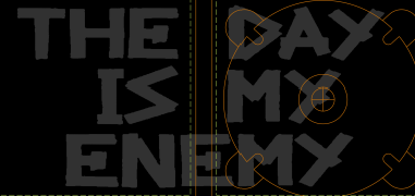
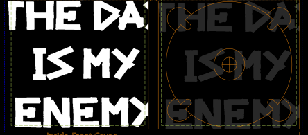
As for refinements and feedback I decided to create two almost identical inside cover digipak designs, but change the song title slightly within each design. After doing some audience research, It was concluded that the first option was the better one.
Below is the tally chart I took to gather my information.


No comments:
Post a Comment